Chat Module
Overview
The chat module allows you to interact with and modify users chat feeds.
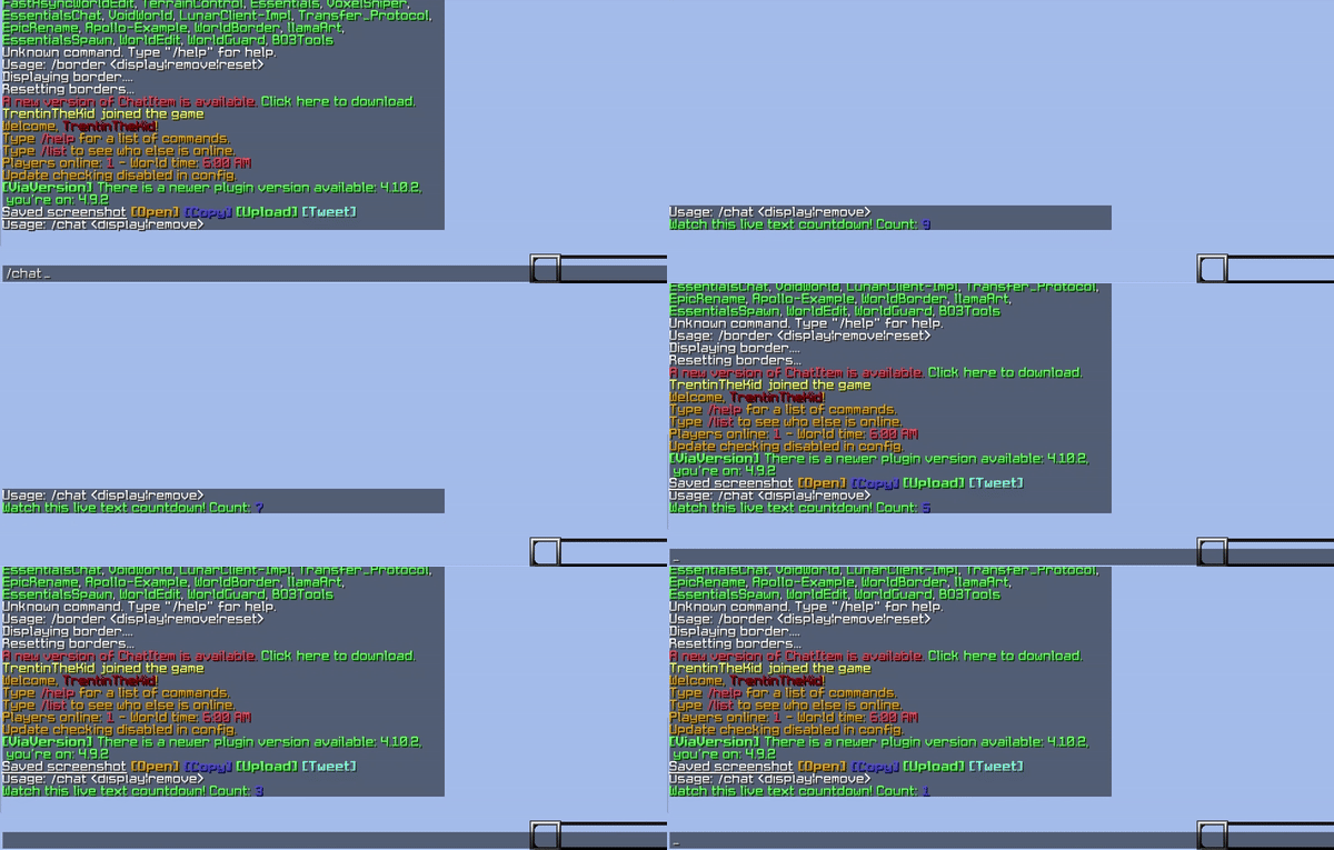
- Adds the ability to simulate live updating messages
- Grants the ability to remove specific messages for a player
- Display clickable chat buttons in a fixed-size box between the chat input field and the chat log.
- Ability to mix adventure components and icons inside a single button.
- Ability to customize the button shape, size, position, colors and hover colors.
- Ability to run commands or open URLs on click.
Integration
Sample Code
Explore each integration by cycling through each tab, to find the best fit for your requirements and needs.
Apollo API examples. See General for common patterns and helpers.
Displaying a Live Chat Message
public void displayLiveChatMessageExample() {
    if (ServerUtil.isFolia()) {
        this.runFoliaChatMessageTask();
    } else {
        this.runBukkitChatMessageTask();
    }
}

private void runBukkitChatMessageTask() {
    BukkitRunnable runnable = new BukkitRunnable() {

        private int countdown = 5;

        @Override
        public void run() {
            if (this.countdown > 0) {
                ChatApiExample.this.chatModule.displayLiveChatMessage(Recipients.ofEveryone(),
                    Component.text("Game starting in ", NamedTextColor.GREEN)
                        .append(Component.text(this.countdown, NamedTextColor.BLUE)),
                    13
                );

                this.countdown--;
            } else {
                ChatApiExample.this.chatModule.displayLiveChatMessage(Recipients.ofEveryone(),
                    Component.text("Game started! ", NamedTextColor.GREEN),
                    13
                );

                this.cancel();
            }
        }
    };

    runnable.runTaskTimer(ApolloExamplePlugin.getInstance(), 1L, 20L);
}

private void runFoliaChatMessageTask() {
    AtomicInteger countdown = new AtomicInteger(5);

    Bukkit.getGlobalRegionScheduler().runAtFixedRate(ApolloExamplePlugin.getInstance(), task -> {
        int seconds = countdown.getAndDecrement();
        if (seconds > 0) {
            ChatApiExample.this.chatModule.displayLiveChatMessage(Recipients.ofEveryone(),
                Component.text("Game starting in ", NamedTextColor.GREEN)
                    .append(Component.text(seconds, NamedTextColor.BLUE)),
                13
            );
        } else {
            ChatApiExample.this.chatModule.displayLiveChatMessage(Recipients.ofEveryone(),
                Component.text("Game started! ", NamedTextColor.GREEN),
                13
            );

            task.cancel();
        }
    }, 1L, 20L);
}
Removing a Live Chat Message
public void removeLiveChatMessageExample() {
    this.chatModule.removeLiveChatMessage(Recipients.ofEveryone(), 13);
}
Chat Buttons
Display server-driven clickable buttons on the chat screen. Buttons live in a single invisible fixed-size box
(320x20 GUI-scaled pixels) anchored in the strip between the chat input field and the chat log, visible while the chat screen is open.
Chat buttons are built on Apollo's shared button system: ChatButton extends ApolloButton.
Read the buttons utilities page for the shared
concepts: content, tooltips, click actions, shapes, sizes, colors and the update semantics.
Displaying buttons with the same id replaces the previous button.
Sample Code
Explore each integration by cycling through each tab, to find the best fit for your requirements and needs.
Apollo API examples. See General for common patterns and helpers.
Displaying Chat Buttons
public void displayChatButtonsExample(Player viewer) {
    Optional<ApolloPlayer> apolloPlayerOpt = Apollo.getPlayerManager().getPlayer(viewer.getUniqueId());

    apolloPlayerOpt.ifPresent(apolloPlayer -> {
        ChatButton teamChat = ChatButton.builder()
            .id("team-chat")
            .position(HudPosition.of(0, 2))
            .size(ApolloButtonSize.of(70, 16))
            .shape(ApolloButtonShape.ROUNDED_SQUARE)
            .backgroundColor(ChatButton.DEFAULT_BACKGROUND_COLOR)
            .borderColor(ChatButton.DEFAULT_BORDER_COLOR)
            .content(ApolloButtonContent.builder()
                .append(ItemStackIcon.builder()
                    .itemName("SHIELD")
                    .build())
                .append(Component.text("Team Chat", NamedTextColor.GREEN))
                .scale(1.0F)
                .build())
            .tooltip(ApolloButtonTooltip.of(
                Component.text("Click to switch!", NamedTextColor.YELLOW)))
            .onClick(ApolloButtonAction.runCommand("/channel team"))
            .build();

        this.chatModule.displayChatButtons(apolloPlayer, Arrays.asList(teamChat));
    });
}
Removing a Chat Button
public void removeChatButtonExample(Player viewer) {
    Optional<ApolloPlayer> apolloPlayerOpt = Apollo.getPlayerManager().getPlayer(viewer.getUniqueId());
    apolloPlayerOpt.ifPresent(apolloPlayer -> this.chatModule.removeChatButton(apolloPlayer, "team-chat"));
}
Resetting all Chat Buttons
public void resetChatButtonsExample(Player viewer) {
    Optional<ApolloPlayer> apolloPlayerOpt = Apollo.getPlayerManager().getPlayer(viewer.getUniqueId());
    apolloPlayerOpt.ifPresent(this.chatModule::resetChatButtons);
}
Updating a Chat Button
Replaces the content and/or tooltip of a previously displayed button, leaving all other button properties unchanged. Buttons are matched by id; See the buttons utilities page for the shared update semantics.
public void updateChatButtonExample(Player viewer) {
    Optional<ApolloPlayer> apolloPlayerOpt = Apollo.getPlayerManager().getPlayer(viewer.getUniqueId());

    apolloPlayerOpt.ifPresent(apolloPlayer -> this.chatModule.updateChatButtonContent(apolloPlayer, "public-chat",
        ApolloButtonContent.builder()
            .append(ItemStackIcon.builder()
                .itemName("PAPER")
                .build())
            .append(Component.text("Public Chat", NamedTextColor.AQUA))
            .scale(1.0F)
            .build()));
}
Live Chat Buttons
Content parts and tooltips can be live: instead of a static value, you provide a resolver that is called for each viewing player and re-broadcast automatically by the module (see Live Button Broadcast below).
public void displayLiveChatButtonExample(Player viewer) {
    Optional<ApolloPlayer> apolloPlayerOpt = Apollo.getPlayerManager().getPlayer(viewer.getUniqueId());

    apolloPlayerOpt.ifPresent(apolloPlayer -> {
        ChatButton unread = ChatButton.builder()
            .id("unread")
            .position(HudPosition.of(0, 2))
            .size(ChatButton.SIZE_MEDIUM)
            .shape(ApolloButtonShape.ROUNDED_SQUARE)
            .backgroundColor(ChatButton.DEFAULT_BACKGROUND_COLOR)
            .borderColor(ChatButton.DEFAULT_BORDER_COLOR)
            .content(ApolloButtonContent.builder()
                .append(Component.text("Unread: ", NamedTextColor.GRAY))
                .append(apolloViewer -> Component.text(getUnreadCount(apolloViewer.getUniqueId()), NamedTextColor.RED), Duration.ofSeconds(1))
                .scale(0.85F)
                .build())
            .build();

        this.chatModule.displayChatButton(apolloPlayer, unread);
    });
}
ChatButton Options
ChatButton extends ApolloButton. All shared options: .id(...), .shape(...), .backgroundColor(...) & .borderColor(...),
.content(...), .tooltip(...), .onClick(...) and the hovered color overrides are documented on the buttons utilities page,
along with the ApolloButtonContent, ApolloButtonTooltip and ApolloButtonAction builders used above.
.position(HudPosition) the button position, in GUI-scaled pixels. The button must fit inside the 320x20 box (ChatButton.BOX_WIDTH x ChatButton.BOX_HEIGHT), so x + width <= 320 and y + height <= 20.
.position(HudPosition.of(0, 2)).size(ApolloButtonSize) the button size, in GUI-scaled pixels. Use one of the suggested chat sizes:
ChatButton.SIZE_SMALL (56x16, five fit side by side), SIZE_MEDIUM (96x16, three fit side by side) or
SIZE_ICON (16x16, for square icon-only buttons) or a fully custom size via ApolloButtonSize.of(width, height).
.size(ChatButton.SIZE_MEDIUM)
.size(ApolloButtonSize.of(56, 16))
Live Button Broadcast
Chat buttons displayed through the Apollo API with live content parts or a live tooltip are re-resolved and
re-sent automatically while the buttons.live-broadcast option is enabled (disabled by default); no
scheduler code required. The broadcast engine ticks every server tick (50ms) and
sends each live piece whenever its own update interval elapses, refreshing content and tooltip independently.
Every live part and live tooltip carries its own update interval, set through the content builder's
append(resolver, Duration) (or ApolloButtonContentPart.live(resolver, Duration)) and ApolloButtonTooltip.live(resolver, Duration).
Lightweight integrations replicate this by re-sending UpdateChatButtonMessage from their own repeating task.
With only buttons.live-broadcast enabled, updates are always sent to every player holding live
buttons, even while their chat is closed. Also enable the packet enrichment module and its player chat
open/close packets and events. Apollo then only sends updates to players who currently have their chat
open, and pushes fresh values the moment the chat is opened.
  modules:
    chat:
      enable: true
      buttons:
-       live-broadcast: false
+       live-broadcast: true
    packet_enrichment:
-     enable: false
+     enable: true
      player-chat-open:
-       send-packet: false
+       send-packet: true
-       fire-apollo-event: false
+       fire-apollo-event: true
      player-chat-close:
-       send-packet: false
+       send-packet: true
-       fire-apollo-event: false
+       fire-apollo-event: true
Default Buttons
Chat buttons can be defined directly in config.yml and displayed automatically when a player joins, without any
plugin code. Set buttons.send-defaults to true (it is false by default) and define the buttons under buttons.defaults.
Config buttons are static: text is read as legacy strings (&-color codes) and icons as icon
definitions. Live content parts and live tooltips require a resolver and are therefore only available
through the API.
modules:
  chat:
    buttons:
      send-defaults: true
      defaults:
      - id: team-chat
        position:
          x: 0.0
          y: 2.0
        size:
          width: 70.0
          height: 16.0
        shape: ROUNDED_SQUARE          # ROUNDED_SQUARE or CIRCLE
        background-color: '#80000000'  # '#RRGGBB' or '#AARRGGBB'
        border-color: '#80000000'
        content:
          scale: 1.0
          parts:                       # each part is a 'text' or an 'icon'
          - icon:
              name: SHIELD
          - text: '&aTeam Chat'
        tooltip:
        - '&eClick to switch!'
        on-click:                      # one of run-command, open-url or client-action
          run-command: /channel team
Example Layouts
The example plugin ships two complete, runnable chat button layouts, each implemented in all three integration flavors.
The Apollo API version of both layouts is shown below, the apollo-protos and JSON versions are linked underneath each one, and both share a ChatButtonParts (opens in a new tab) helper (JSON variant (opens in a new tab)) for the pieces every button needs.
Channels Layout
Chat channel switchers: Team, Public and Party.
TODO: Add image/gif
public static void display(ChatModule chatModule, Player viewer) {
    Apollo.getPlayerManager().getPlayer(viewer.getUniqueId()).ifPresent(apolloPlayer -> {
        ChatButton teamChat = ChatButton.builder()
            .id("team-chat")
            .position(HudPosition.of(0, 2))
            .size(ApolloButtonSize.of(70, 16))
            .shape(ApolloButtonShape.ROUNDED_SQUARE)
            .backgroundColor(ChatButton.DEFAULT_BACKGROUND_COLOR)
            .borderColor(ChatButton.DEFAULT_BORDER_COLOR)
            .content(ApolloButtonContent.builder()
                .append(ItemStackIcon.builder()
                    .itemName("SHIELD")
                    .build())
                .append(Component.text("Team Chat", NamedTextColor.GREEN))
                .scale(1.0F)
                .build())
            .tooltip(ApolloButtonTooltip.of(Component.text("Click to switch!", NamedTextColor.YELLOW)))
            .onClick(ApolloButtonAction.runCommand("/channel team"))
            .build();

        ChatButton publicChat = ChatButton.builder()
            .id("public-chat")
            .position(HudPosition.of(76, 2))
            .size(ApolloButtonSize.of(78, 16))
            .shape(ApolloButtonShape.ROUNDED_SQUARE)
            .backgroundColor(ChatButton.DEFAULT_BACKGROUND_COLOR)
            .borderColor(ChatButton.DEFAULT_BORDER_COLOR)
            .content(ApolloButtonContent.builder()
                .append(ItemStackIcon.builder()
                    .itemName("OAK_SIGN")
                    .build())
                .append(Component.text("Public Chat"))
                .scale(1.0F)
                .build())
            .tooltip(ApolloButtonTooltip.of(Component.text("Click to switch!", NamedTextColor.YELLOW)))
            .onClick(ApolloButtonAction.runCommand("/channel public"))
            .build();

        ChatButton partyChat = ChatButton.builder()
            .id("party-chat")
            .position(HudPosition.of(160, 2))
            .size(ApolloButtonSize.of(76, 16))
            .shape(ApolloButtonShape.ROUNDED_SQUARE)
            .backgroundColor(ChatButton.DEFAULT_BACKGROUND_COLOR)
            .borderColor(ChatButton.DEFAULT_BORDER_COLOR)
            .content(ApolloButtonContent.builder()
                .append(ItemStackIcon.builder()
                    .itemName("FIREWORK_ROCKET")
                    .build())
                .append(Component.text("Party Chat", NamedTextColor.LIGHT_PURPLE))
                .scale(1.0F)
                .build())
            .tooltip(ApolloButtonTooltip.of(Component.text("Click to switch!", NamedTextColor.YELLOW)))
            .onClick(ApolloButtonAction.runCommand("/channel party"))
            .build();

        chatModule.displayChatButtons(apolloPlayer, Arrays.asList(teamChat, publicChat, partyChat));
    });
}
The same layout built with raw payloads: apollo-protos implementation (opens in a new tab) · JSON implementation (opens in a new tab)
Staff Chat Layout
Staff and Public channel switchers plus Clear, Mute and Unmute quick actions.
TODO: Add image/gif
public static void display(ChatModule chatModule, Player viewer) {
    Apollo.getPlayerManager().getPlayer(viewer.getUniqueId()).ifPresent(apolloPlayer -> {
        ChatButton staffChat = ChatButton.builder()
            .id("staff-chat")
            .position(HudPosition.of(0, 2))
            .size(ApolloButtonSize.of(70, 16))
            .shape(ApolloButtonShape.ROUNDED_SQUARE)
            .backgroundColor(ChatButton.DEFAULT_BACKGROUND_COLOR)
            .borderColor(ChatButton.DEFAULT_BORDER_COLOR)
            .content(ApolloButtonContent.builder()
                .append(ItemStackIcon.builder()
                    .itemName("COMMAND_BLOCK")
                    .build())
                .append(Component.text("Staff Chat", NamedTextColor.AQUA))
                .scale(1.0F)
                .build())
            .tooltip(ApolloButtonTooltip.of(Component.text("Click to switch!", NamedTextColor.YELLOW)))
            .onClick(ApolloButtonAction.runCommand("/channel staff"))
            .build();

        ChatButton publicChat = ChatButton.builder()
            .id("public-chat")
            .position(HudPosition.of(76, 2))
            .size(ApolloButtonSize.of(78, 16))
            .shape(ApolloButtonShape.ROUNDED_SQUARE)
            .backgroundColor(ChatButton.DEFAULT_BACKGROUND_COLOR)
            .borderColor(ChatButton.DEFAULT_BORDER_COLOR)
            .content(ApolloButtonContent.builder()
                .append(ItemStackIcon.builder()
                    .itemName("OAK_SIGN")
                    .build())
                .append(Component.text("Public Chat"))
                .scale(1.0F)
                .build())
            .tooltip(ApolloButtonTooltip.of(Component.text("Click to switch!", NamedTextColor.YELLOW)))
            .onClick(ApolloButtonAction.runCommand("/channel public"))
            .build();

        ChatButton clearChat = ChatButton.builder()
            .id("clear-chat")
            .position(HudPosition.of(160, 2))
            .size(ApolloButtonSize.of(44, 16))
            .shape(ApolloButtonShape.ROUNDED_SQUARE)
            .backgroundColor(ChatButton.DEFAULT_BACKGROUND_COLOR)
            .borderColor(ChatButton.DEFAULT_BORDER_COLOR)
            .content(ApolloButtonContent.builder()
                .append(ItemStackIcon.builder()
                    .itemName("SPONGE")
                    .build())
                .append(Component.text("Clear", NamedTextColor.YELLOW))
                .scale(1.0F)
                .build())
            .tooltip(ApolloButtonTooltip.of(Component.text("Clears the public chat", NamedTextColor.GRAY)))
            .onClick(ApolloButtonAction.runCommand("/clearchat"))
            .build();

        ChatButton muteChat = ChatButton.builder()
            .id("mute-chat")
            .position(HudPosition.of(210, 2))
            .size(ApolloButtonSize.of(44, 16))
            .shape(ApolloButtonShape.ROUNDED_SQUARE)
            .backgroundColor(ChatButton.DEFAULT_BACKGROUND_COLOR)
            .borderColor(ChatButton.DEFAULT_BORDER_COLOR)
            .content(ApolloButtonContent.builder()
                .append(ItemStackIcon.builder()
                    .itemName("BARRIER")
                    .build())
                .append(Component.text("Mute", NamedTextColor.RED))
                .scale(1.0F)
                .build())
            .tooltip(ApolloButtonTooltip.of(Component.text("Mutes the public chat", NamedTextColor.GRAY)))
            .onClick(ApolloButtonAction.runCommand("/mutechat"))
            .build();

        ChatButton unmuteChat = ChatButton.builder()
            .id("unmute-chat")
            .position(HudPosition.of(260, 2))
            .size(ApolloButtonSize.of(56, 16))
            .shape(ApolloButtonShape.ROUNDED_SQUARE)
            .backgroundColor(ChatButton.DEFAULT_BACKGROUND_COLOR)
            .borderColor(ChatButton.DEFAULT_BORDER_COLOR)
            .content(ApolloButtonContent.builder()
                .append(ItemStackIcon.builder()
                    .itemName("BELL")
                    .build())
                .append(Component.text("Unmute", NamedTextColor.GREEN))
                .scale(1.0F)
                .build())
            .tooltip(ApolloButtonTooltip.of(Component.text("Unmutes the public chat", NamedTextColor.GRAY)))
            .onClick(ApolloButtonAction.runCommand("/unmutechat"))
            .build();

        chatModule.displayChatButtons(apolloPlayer, Arrays.asList(staffChat, publicChat,
            clearChat, muteChat, unmuteChat));
    });
}
The same layout built with raw payloads: apollo-protos implementation (opens in a new tab) · JSON implementation (opens in a new tab)
Available options
-
BROADCAST_LIVE_BUTTONS- Whether live chat button content is automatically re-resolved and re-sent to viewers.
- Values
- Type:
Boolean - Default:
false
- Type:
-
SEND_DEFAULT_BUTTONS- Whether the default buttons are displayed to players when they join.
- Values
- Type:
Boolean - Default:
false
- Type:
-
DEFAULT_BUTTONS- The default buttons displayed to joining players while
buttons.send-defaultsis enabled. - Values
- Type:
List<ChatButton> - Default:
chat-channels sample buttons
- Type:
- The default buttons displayed to joining players while